


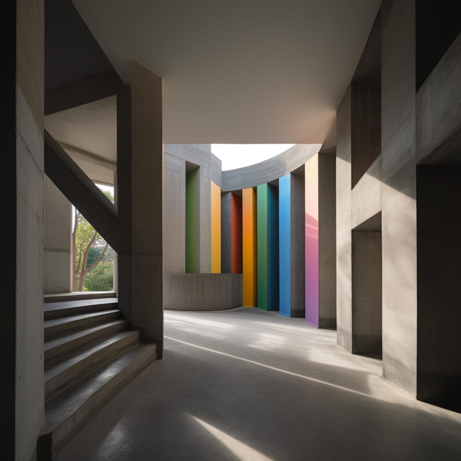
Color Isn’t Just on the Walls
When we enter a room, we often notice the color first. Before even noticing the furniture, details or materials, there is a sensation that happens almost instantly.
A space can feel welcoming, sophisticated, fresh, intimate, or vibrant. And color plays an important role in this perception.
But choosing a color for an interior project goes far beyond deciding between beige, green, or blue.
The same color can produce completely different sensations depending on the natural light, the artificial lighting, the materials that accompany it, the size of the space and even the landscape that appears through the windows.
That’s why, in architecture, we don’t believe in a simple rule like “blue soothes” or “yellow brings joy”.
The color needs to make sense within the set.
The Psychology of Colors in Architecture
There is, yes, a relationship between colors, perception and emotions. But it is not a universal formula.
Our personal experiences, culture, memories, and context also influence how we perceive a particular color.
A deep red can bring intensity and sophistication to a room. The same red, used in excess or combined inappropriately, can make the environment visually tiring.
A soft green can create a tranquil and natural atmosphere. A deeper green can bring drama, elegance and personality.
It is precisely in this difference that the work of a good project lies.
Color Changes with Light
One of the biggest mistakes in choosing colors is to look at a small sample in a store and imagine that it will look exactly that way at home.
It won’t.
Natural light completely alters the perception of a color.
A north-facing environment, for example, may receive a different light from a south-facing environment. Throughout the day, the same wall can take on different nuances.
And there is also artificial lighting and the reflection of light that comes from outside.
A warmer bulb can enhance certain earthy tones, beiges, and woods. Cooler lighting can alter the perception of tones and make some colors more bluish or grayish.
Therefore, a color should never be chosen in isolation.
It needs to be observed in the space where it will be used.
Color Is Also in the Materials
When we think of color in an interior project, we usually think of paint.
But the color is in everything.
It is in wood, stone, fabrics, carpets, works of art, metals, furniture and even the outdoor landscape.
Imagine a room with neutral walls, but with a large terracotta-tone sofa, natural wood, a stone with striking veins and a work of art with green tones.
This environment already has a color palette.
None of these choices need to compete with the other. On the contrary. When there is balance, the elements begin to talk to each other.
That’s what turns a beautiful décor into a well-thought-out interior design.
Four Color Families That Work Great in Interiors
Warm Neutrals
Beige, sand, cream, caramel and different shades of brown continue to be very present choices in contemporary architecture.
But there is a huge difference between a neutral environment and an environment without personality.
Neutrals can create a sophisticated and timeless base when they are crafted through different textures and materials.
Wood, linen, stone, bouclé, leather, and ceramics can create depth even when the palette is understated.
Greens
Greens bring the interior closer to nature and can create extremely elegant environments.
Soft greens work very well in spaces where a tranquil atmosphere is sought. Deeper tones, on the other hand, can create more immersive and sophisticated environments.
And perhaps one of the most beautiful combinations is precisely the one that brings green closer to natural materials, such as wood and stone.
It was exactly this type of relationship that we explored in some of our projects.
Take a look at this CW project with green as the protagonist: https://cwarquitetura.pt/projetos/arquitetura-de-luxo-em-portugal/
Blues
Blues can bring freshness, depth, and tranquility to interiors.
Very light tones can create a light and luminous feeling. Deeper blues, on the other hand, can add drama and sophistication.
In bedrooms, bathrooms and environments close to the water, blue can create an especially interesting connection with the architecture and the landscape itself.
But again, there is no single rule.
The secret is in the shade, proportion and combinations.
Terracottas and Reddish Tones
The earthy and reddish tones add warmth and personality.
Terracotta, rust, burgundy, and other near-earth tones can appear on walls, upholstery, rugs, objects, or artwork.
When used with balance, they create cozy and sophisticated environments without necessarily becoming excessive.
What if the Color Isn’t on the Wall?
This is one of the questions we like to ask the most during a project.
Because it is not always necessary to paint a wall to bring color to an environment.
An armchair, a curtain, a rug, a piece of art or even a stone can be enough to completely transform the atmosphere.
This strategy also allows you to create more flexible environments.
The base can remain neutral while elements that bring color can be replaced over time.
It’s a smart way to keep up with changes in taste without having to transform the entire space.
What We’re Seeing in 2026 Interiors
At major European architecture, design and interior fairs, we have observed an increasing appreciation of welcoming environments, natural materials and less obvious palettes.
After visiting Maison&Objet, in Paris, and closely following the main international trends, one thing is clear: contemporary interiors are less and less concerned with creating simply “instagrammable” environments and more interested in creating spaces with identity.
Neutrals are still present, but they are accompanied by texture, wood, stone and deeper tones.
Natural greens are still strong.
Earthy tones add warmth.
And more striking colors appear in a punctual way, often through pieces of furniture, lighting, art and objects.
The most interesting trend, for us, is not a specific color.
It’s the freedom to build a palette with personality.
The Most Common Mistakes When Choosing a Color
Choosing Just Because It’s Fashionable
A trend can be a great inspiration, but it shouldn’t determine the identity of your home.
What is on the rise today may no longer make sense tomorrow.
A good palette needs to talk to the architecture and, especially, to those who live in that space.
Ignore the Light
The color of the wall needs to be analyzed in the real environment, at different times and lighting conditions.
Using Too Many Colors Without a Relationship Between Them
There is no magic number of colors that we should use in an environment.
The important thing is that there is a relationship between them.
A well-constructed palette can have multiple shades without looking cluttered.
Think Only of Paint
As we have seen, color is also material.
Sometimes, the best way to add a new shade to the room is not to paint a wall, but to choose a piece of wood, a fabric, a stone or a piece of furniture.
Forgetting the Personality of Those Who Live There
Perhaps this is the most important mistake.
A house shouldn’t look like a catalog.
She needs to tell a story about the people who live in her.
How to Choose the Right Color for Your Home?
Before choosing a color, it is worth asking:
- How do I want to feel in this environment?
- Do I want him to be welcoming?
- More sophisticated?
- Light?
- Intimate?
- Energetic?
- Calm?
After that, you have to look at everything that already exists in the space: architecture, light, materials, furniture, and landscape.
From then on, color is no longer an isolated choice and becomes part of a composition.
And that’s exactly where architecture makes a difference.
Color Should Transform the Experience of Living
A good color choice doesn’t have to draw attention.
Sometimes, it simply makes you want to stay longer in that environment.
It can make a living room more welcoming, a bedroom quieter, a bathroom more enveloping or a social area more inviting.
Color doesn’t have to dominate space. It needs to belong to it.
At CW, we work on the choice of colors as part of a broader vision of the project, considering architecture, lighting, materials, furniture and, above all, the personality of those who will live in this space.
Because a truly special home is not one that follows all the trends.
It is the one that makes sense to those who inhabit it.
CTA: Want to find out which colors can transform your home? CW can help you create a palette designed for your architecture, the light in your space, and the way you want to live.